Hautkrebsvorsorge in Essen – für maximale Sicherheit Ihrer Haut
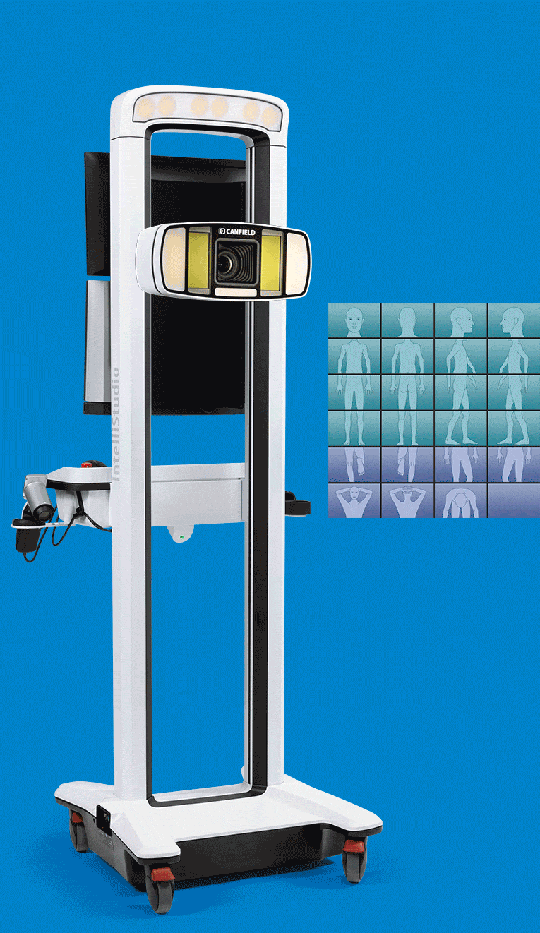
Mit unserem Body-Mapping-Hautscanner der neuesten Generation erkennen unsere dermatologischen Ärzte selbst kleinste Hautveränderungen frühzeitig.
- Präzise Ganzkörperanalyse mit modernster Technik
- Untersuchung durch erfahrene Dermatologen in Essen
- Schnelle, sichere und zuverlässige Vorsorge

4,8 von 5 Sternen (> 52 Bewertungen)

High-Tech in Expertenhand
- Modernste Untersuchungstechnologien für eine präzise Hautanalyse
- Langjährige dermatologische Erfahrung unserer Ärzte
- Persönliche Betreuung durch ein kompetentes und engagiertes Praxisteam
Bestmögliche Vorsorgeuntersuchung
- Präzise Ganzkörperanalyse durch moderne Body-Mapping-Technologie
- Hochauflösende Erfassung sämtlicher Hautbereiche
- Empfehlung einer jährlichen Kontrolluntersuchung für eine optimale Hautkrebsvorsorge
Präziser als das bloße Auge
- Spezielle optische Verfahren für eine besonders präzise Hautanalyse
- Softwaregestützte Auswertung für maximale Genauigkeit
- Erkennung minimaler Hautveränderungen, die auf ein mögliches Hautkrebsrisiko hinweisen können
Beste Ergebnisse durch KI-gestützte Hautanalyse
- Hochpräzise Bildanalyse durch moderne Deep-Learning-Technologie
- Erkennung selbst kleinster Hautveränderungen
- Zuverlässige Grundlage für die dermatologische Diagnose
Bekannt aus

Muttermale im Blick behalten: Wann Vorsorge wichtig ist
Pigmentmale, auch Leberflecke oder Muttermale genannt, hat beinahe jeder Mensch. In den meisten Fällen sind sie harmlos, doch manche Pigmentmale können sich zu malignen Melanomen (schwarzer Hautkrebs) entwickeln.
Schwarzer Hautkrebs kann, wie andere Hautkrebsarten auch, lebensgefährlich werden, wenn er nicht rechtzeitig erkannt und behandelt wird. Deshalb ist es besonders wichtig, dass sich verändernde Muttermale frühzeitig von einem Dermatologen untersucht werden.
Mit einer professionellen Hautkrebsvorsorge können auffällige Pigmentmale rechtzeitig erkannt und sicher behandelt werden.
4,8 von 5 Sternen (> 52 Bewertungen)

Die Stadien des Schwarzen Hautkrebs
Wird ein malignes Melanom (schwarzer Hautkrebs) nicht rechtzeitig diagnostiziert und behandelt, entwickelt sich die Erkrankung in mehreren Stadien weiter, bis sie schließlich Lymphknoten und innere Organe befällt.
Im letzten Stadium ist die Erkrankung oft lebensbedrohlich.
Früherkennung rettet Leben: Mit einer regelmäßigen Hautkrebsvorsorge können Veränderungen an Muttermalen frühzeitig erkannt und behandelt werden.
4,8 von 5 Sternen (> 52 Bewertungen)
0%
Mehr stationäre Hautkrebsbehandlungen
0%
Mehr Todesfälle durch Hautkrebs
? % Ihr persönliches Hautkrebsrisiko?
Vergleich von 2002 bis 2022.
Quelle beider Angaben: Statistisches Bundesamt

Wie kann man bösartige Muttermale erkennen?
Um auffällige Muttermale frühzeitig zu erkennen, orientieren sich Dermatologen häufig an der sogenannten ABCDE-Regel. Sie hilft dabei, Pigmentmale systematisch zu beurteilen und mögliche Veränderungen schneller zu erkennen. Dabei werden fünf wichtige Merkmale eines Muttermals betrachtet:
A – Ausdehnung / Asymmetrie
Ein unauffälliges Muttermal ist meist rund oder oval und gleichmäßig geformt. Wirkt es asymmetrisch oder unregelmäßig, sollte es untersucht werden.
B – Begrenzung
Sind die Ränder eines Muttermals unscharf, gezackt oder ausgefranst, kann dies ein Hinweis auf mögliche Veränderungen der Haut sein.
C – Colorit (Färbung)
Zeigt ein Muttermal mehrere Farbtöne, etwa hellbraun, dunkelbraun, schwarz oder rötlich, sollte dies ärztlich abgeklärt werden.

D – Durchmesser
Muttermale mit einem Durchmesser von mehr als fünf bis sechs Millimetern sollten regelmäßig von einem Dermatologen kontrolliert werden.
E – Entwicklung/Erhabenheit der Muttermale
Besonders wichtig ist, ob sich ein Muttermal verändert, etwa in Größe, Form, Farbe oder Höhe, und deshalb untersucht werden sollte.
Selbstbeobachtung
Auch wenn diese Kriterien eine erste Orientierung geben, ersetzt Selbstbeobachtung keine professionelle Hautanalyse.
Muttermale untersuchen lassen: Hautkrebs frühzeitig erkennen und vorbeugen
Auch wenn Muttermale meist harmlos sind, können an auffälligen Stellen Symptome wie Juckreiz und Blutungen auftreten. Wenn Sie den Eindruck haben, dass eines oder mehrere Ihrer Muttermale auffällig sind, sollten Sie umgehend eine dermatologische Facharztpraxis aufsuchen.
Eine regelmäßige Selbstbeobachtung ist zwar wichtig, kann jedoch eine professionelle Hautkrebsvorsorge nicht ersetzen. Nur eine gezielte Untersuchung durch unser Ärzteteam mit modernem Hautscanner erkennt Veränderungen frühzeitig und minimiert das Risiko von Hautkrebs.
Lassen Sie Ihre Muttermale regelmäßig prüfen, für Ihre Sicherheit und Gesundheit.
4,8 von 5 Sternen (> 52 Bewertungen)

Wie läuft mein Vorsorgetermin ab?
1
Ausführliche Untersuchung
Zu Beginn erfolgt eine gründliche Hautanalyse mit unserem modernen Hautscanner, durchgeführt von einem erfahrenen Dermatologen.
Im anschließenden Arztgespräch haben Sie die Möglichkeit, Ihre eigenen Hautbeobachtungen zu schildern. Gleichzeitig erhalten Sie wertvolle, individuelle Empfehlungen zur effektiven Hautkrebsprävention und frühzeitigen Erkennung von Hautveränderungen.
2
Individuelles Diagnosegespräch

Nach der Untersuchung erstellt der behandelnde Dermatologe eine fundierte und umfassende Diagnose.
Dabei werden sowohl alle ärztlichen Befunde als auch die durch den Hautscanner gewonnenen und mithilfe modernster KI-Technologie ausgewerteten Daten berücksichtigt. So entsteht ein präzises, ganzheitliches Hautbild als Grundlage für Ihre individuelle Beratung und weitere Behandlung.
3
Im Falle einer Hautkrebsdiagnose
Wird bei Ihnen ein erhöhtes oder akutes Hautkrebsrisiko festgestellt, erhalten Sie umgehend einen Termin zur schnellen und fachgerechten Behandlung direkt vor Ort durch unser erfahrenes Ärzteteam.
Im Anschluss an die Therapie erfolgt ein individuelles, auf Ihre Diagnose abgestimmtes Nachsorgegespräch. Dabei erhalten Sie gezielte Empfehlungen zur weiteren Behandlung, Kontrolle und nachhaltigen Hautgesundheit.
Das sagen unsere Patienten:
Ihre Zufriedenheit ist unser Anspruch. Erfahren Sie, welche Erfahrungen Patienten mit unserem KI-gestützten Hautscanner gemacht haben.
4,8 von 5 Sternen (> 52 Bewertungen)
"Ich war wirklich rundum begeistert von meinem Termin!
Die Online-Buchung war denkbar einfach und schnell erledigt.
Besonders beeindruckt hat mich die Hautscanner-Untersuchung – wirklich beeindruckende Technik, und die Auswertung war detailliert und gut verständlich.
Das gesamte Team war ausgesprochen freundlich, kompetent und hat sich richtig viel Zeit genommen. Die Betreuung war einfach klasse – man fühlt sich von Anfang an in guten Händen.
Eine klare Empfehlung für alle, die moderne Diagnostik und einen angenehmen, reibungslosen Ablauf zu schätzen wissen!"
Lini S
Patient
"Sehr moderne Praxis mit innovativem KI-gestütztem Hautscanner.
Die Untersuchung war äußerst professionell und strukturiert. Besonders beeindruckend fand ich die präzise Ganzkörperaufnahme und die digitale Analyse der Hautveränderungen.
Man fühlt sich medizinisch sehr gut aufgehoben und gleichzeitig technisch auf dem neuesten Stand.
Das Team war freundlich, kompetent und hat sich ausreichend Zeit genommen 💖🙏🏻
Absolute Empfehlung für moderne Hautkrebsvorsorge und dermatologische Diagnostik in Essen!"
ella elka
Patient
"Ich habe eine Hautkrebsvorsorge mit einem KI gestütztem Scanner gemacht. Die Untersuchung war sehr angenehm und professionell.
Die Ärztin hat sich viel Zeit genommen, alles verständlich erklärt und ich habe mich sehr wohl gefühlt.
Auch beim Thema Datenschutz wurde ich gut informiert, sodass ich mich mit meinen Patientendaten sicher fühle.
Klare Weiterempfehlung!"
Thanos A
Patient
"Super tolle Praxis 👍
Kann ich nur Empfehlen!
Es wird wirklich Perfekt beraten und behandelt 😊
Überwältigt bin ich vorallem vom Hautscanner! So Modern und Professionell!
Lohnt sich!"
Feyzi Ekinci
Patient
"Super nettes Personal! Wirklich professionell und zuvorkommend!
Es war toll, den ganzen Körper mit dem gründlichen Hautscanner untersuchen zu lassen 👍🏼👍🏼"
Mads Dyrløv
Patient
"Ein wirklich netter Arzt.
Wir haben den Hautscanner ausprobiert, er war sehr gut und hat einwandfrei funktioniert."
Anton Mouritsen
Patient
Vorteile der Vorsorgeuntersuchung mit unserem Hautscanner - schnell, präzise und zuverlässig
Hautkrebsvorsorge mit Hautscanner: Ihre Vorteile im Überblick
Herkömmliche Vorsorgeuntersuchung mit Standardverfahren
Einfache Kassenleistung ohne vollständige Ausschöpfung modernster medizintechnischer Vorsorgemöglichkeiten.
Eine Vorsorgeuntersuchung kann vergleichsweise leicht bereitgestellt werden und wird häufig auch von Nichtfachärzten durchgeführt.
Sie trägt zur Sensibilisierung für die Gefährlichkeit von Hautkrebs bei und stärkt das Bewusstsein für regelmäßige Kontrollen.
Erste Auffälligkeiten der Haut können frühzeitig erkannt werden.
Häufig erfolgt keine vollständige Untersuchung des gesamten Körpers, wodurch Hautveränderungen unentdeckt bleiben können.
Die Untersuchung wird oft lediglich mit bloßem Auge durchgeführt.
Der Einsatz moderner Verfahren wie der Dermatoskopie ist nicht immer gegeben.
Selbst bei Nutzung einer Lupe fehlt meist die Möglichkeit einer digitalen Dokumentation des Hautzustands.
Es mangelt häufig an standardisierten Lichtverhältnissen, die für exakte medizinische Bildaufnahmen notwendig sind.
Es mangelt häufig an standardisierten Lichtverhältnissen, die für exakte medizinische Bildaufnahmen notwendig sind.
Vollständige Vorsorgeuntersuchung mit unserem High-Tech-Hautscanner
Selbstzahlerpreis für gesetzlich Versicherte pro Untersuchung:
199,72 € (steuerlich absetzbar).
Ganzkörper-Body-Mapping ermöglicht eine lückenlose Erfassung der Haut mit hochauflösender fotografischer Dokumentation einzelner Muttermale.
Moderne Systeme wie der Mole Analyzer bieten zusätzliche Spezialuntersuchungen zur Hautanalyse.
Die digitale Auflichtmikroskopie (Dermatoskopie) erlaubt eine detaillierte Untersuchung und Verlaufsdokumentation einzelner Hautläsionen.
Exakter Vergleich des Hautzustands über längere Zeiträume durch digitale Archivierung.
Standardisierte und optimale Lichtverhältnisse sorgen für hochpräzise medizinische Bildgebung.
Der Einsatz moderner Optiken und DSLR-Technologie ermöglicht exzellente medizinische Fotografien.
Deutlich gründlichere Hautkrebsvorsorge durch innovative Bildgebungsverfahren
Frühzeitige Erkennung von Hautveränderungen und Risiken
Kombination aus langjähriger ärztlicher Erfahrung und modernster High-Tech-Diagnostik
Jetzt Vorsorgetermin buchen
Wir melden uns spätestens am nächsten Werktag mit einem passenden Terminvorschlag für Ihre Hautkrebsvorsorge im DERMAZENTRUM Neuss bei Ihnen zurück.
Geburtstag
Telefon
Mit dem Absenden akzeptieren Sie unsere
Datenschutzhinweise.
Ihre Angaben nutzen wir zur Bearbeitung Ihrer Anfrage und
zur Kontaktaufnahme.
Häufig gestellte Fragen
Hier finden Sie Antworten auf die am häufigsten gestellten Fragen zu unseren Leistungen und Ihrer Behandlung.
Was sind die Unterschiede einer Hautkrebsvorsorgeuntersuchung mit dem Hautscanner gegenüber einer herkömmlichen Vorsorgeuntersuchung?
Muss ich mich für eine Full-Body-Scan-Untersuchung mit dem Hautscanner vollständig entkleiden?
Bei meiner Vorsorgeuntersuchung wurde ein Hautkrebsverdacht oder eine akute Hautkrebserkrankung festgestellt.
Wie geht es jetzt weiter?
Wieviel kostet eine Hautkrebsvorsorge mit
Full-Body-Scan im DERMAZENTRUM Essen?
Ich habe sehr viele Muttermale. Steigt dadurch der für gesetzlich Versicherte zu zahlende Eigenanteil des Full-Body-Scans?
Ich bin tätowiert. Stellt dies ein Problem für die Durchführung einer Hautkrebsvorsorgeuntersuchung mit dem Hautscanner dar?
Sind diese Kosten steuerlich absetzbar?
Wo befindet sich das DERMAZENTRUM Essen?
So finden Sie unsere Praxis
Dermazentrum Essen
Kopstadtplatz 24 - 25
45127 Essen